Monday, June 7, 2010
Street Fighter Desire - Vega
"Street Fighter Desire - Vega" is a digital short that Ted and I made over the weekend. It had been a while since either of us had done video content. We've both been meaning to get back into it since PixelDrip, as a gallery and a community, is starting to grow. What better way to make a return than with a video about how Street Fighter affects Ted's life?
Ted really did injure his ankle a couple weeks ago during a karaoke session. It should be back to normal in a little over a month's time. Until then, he pretty much just stays in the apartment due to limited mobility. I decided to take him to the Video Game Sunday! (VGS!) Super Street Fighter IV tournament at the Draft Bar to get his mind off of his injury. I started shooting video of him before we left because we would usually document our tournament outings.
Seeing Ted hop around to go compete reminded me of the "Desire" promotional videos that ran during the WWF/WWE's Attitude era. The karaoke-related ankle injury kept the tone from being too serious. I took some creative liberties by writing in the video game rivalry between me and Ted as the reason for his injury. Being beaten by a joystick was still silly but not as embarrassing as a fall from singing along to Motley Crue's "Dr. Feelgood." We also had a year's worth of archive footage from our respective video shoots within the fighting game community.
Ted used Adobe Premiere for editing. I've only used Premiere one time before now, having used Final Cut Pro instead. Ted only had experience with Windows Movie Maker. Suffice to say, he was blown away by the editing possibilities. Fortunately for us, the newest version of Premiere has definitely come a long way from the clunky user interfaces of the past versions.
We're both satisfied with how the video turned out in the end. You can take it for the joke that it is, but you can also see some truth in Ted's passion for Street Fighter. Of course, we'd also like to thank VGS!, L.A. Button Mashers, and the Draft Bar for organizing the June 5th event in the first place. They plan on having more events in the future, so stay tuned for additional digital shorts.
Monday, April 26, 2010
PixelDrip Gallery at UGTL
This past April 24th was the first PixelDrip gallery at the Underground Tournament League. Previously, the art was drawn live and sold at the event. J came up with PixelDrip to open up the art contributions to Los Angeles based artists, as well as give the artists more time to create a piece. I think that was a great decision. There were 17 great submissions and I'll talk about some of my favorites since I already posted about my process for "Tiger of Death."

J's "Yoga Papercraft" was a sort of 3-dimensional piece with different layers of paper placed at various distances. It's hard to see in the photo but the piece had great use of depth, something I've always enjoyed ever since I was introduced to the concept of dioramas.

Jessica G's "Casuals" drawing of the characters playing in the living room is jam packed with details. If you take the time to look at everything, you'll notice the decals on the joysticks, the texture of the carpet, and even the Korean writing on the refrigerator. I believe she said it took her well over 20 hours to complete it, many of which were broadcast over Ustream. Again, I encourage all artists to share the creative process through venues like Ustream or blogging. It shows the effort that a lot of us put into our art, which all too often gets overlooked once the finished product is on display.

Celina Armenta's "Make Love, Not War" also turned heads, but in a different way. The painting of Ryu and Ken kissing was definitely on the controversial side. I was watching the viewers that walked by all day and their reactions ranged from laughter to disgust. I remember a couple weeks back, Celina told me she was afraid it might get rejected. I'm glad she went through with it anyways. Art should get people talking. It was also IMMEDIATELY sold once the gallery opened to viewers.

Naomi Baker contributed these three digital paintings. I was a little surprised with how popular Dhalsim was for the artists. I think it's due to his stretchy limbs and fire breathing since they make for some great visuals.

Of course, there was still live art going on throughout the event via Simon and Jessica. They were able to pump out seven larger Street Fighter character illustrations with a couple smaller sketches added into the mix. That's within a span of around six hours. I wish I can draw as fast as those two can.
Diego Paz and Sasha Palacio showed up to the event a bit later so I wasn't able to get photos of their work. Diego created two kick ass digital paintings of Akuma and Shin Akuma. Sasha also contributed two digital paintings of Crimson Viper and Morrigan. I might write another post in the future of the pieces I didn't comment on if I can get good photos of them.
Overall, it was a great turnout with plenty of positive feedback. Setting it up was a little hectic because the Rec Center Studio didn't allow it until the day of the event. Next time, we'll be better prepared now that we have one show under our belt and know what to expect. The Rec Center Studio in Echo Park was a great place to host and I hope it won't be the last time we'll be there.
J's "Yoga Papercraft" was a sort of 3-dimensional piece with different layers of paper placed at various distances. It's hard to see in the photo but the piece had great use of depth, something I've always enjoyed ever since I was introduced to the concept of dioramas.
Jessica G's "Casuals" drawing of the characters playing in the living room is jam packed with details. If you take the time to look at everything, you'll notice the decals on the joysticks, the texture of the carpet, and even the Korean writing on the refrigerator. I believe she said it took her well over 20 hours to complete it, many of which were broadcast over Ustream. Again, I encourage all artists to share the creative process through venues like Ustream or blogging. It shows the effort that a lot of us put into our art, which all too often gets overlooked once the finished product is on display.
Celina Armenta's "Make Love, Not War" also turned heads, but in a different way. The painting of Ryu and Ken kissing was definitely on the controversial side. I was watching the viewers that walked by all day and their reactions ranged from laughter to disgust. I remember a couple weeks back, Celina told me she was afraid it might get rejected. I'm glad she went through with it anyways. Art should get people talking. It was also IMMEDIATELY sold once the gallery opened to viewers.
Naomi Baker contributed these three digital paintings. I was a little surprised with how popular Dhalsim was for the artists. I think it's due to his stretchy limbs and fire breathing since they make for some great visuals.
Of course, there was still live art going on throughout the event via Simon and Jessica. They were able to pump out seven larger Street Fighter character illustrations with a couple smaller sketches added into the mix. That's within a span of around six hours. I wish I can draw as fast as those two can.
Diego Paz and Sasha Palacio showed up to the event a bit later so I wasn't able to get photos of their work. Diego created two kick ass digital paintings of Akuma and Shin Akuma. Sasha also contributed two digital paintings of Crimson Viper and Morrigan. I might write another post in the future of the pieces I didn't comment on if I can get good photos of them.
Overall, it was a great turnout with plenty of positive feedback. Setting it up was a little hectic because the Rec Center Studio didn't allow it until the day of the event. Next time, we'll be better prepared now that we have one show under our belt and know what to expect. The Rec Center Studio in Echo Park was a great place to host and I hope it won't be the last time we'll be there.
Sunday, April 25, 2010
An Introduction

Hello everyone, I just wanted to introduce myself. My name is Alyse, and I met Mark through a job we both shared at Arclight back in 2008. He approached me about this blog a few weeks ago and I jumped at the chance. I no longer live in the LA area, moved back to my hometown in Nebraska in 2009, but I am excited to share my work and welcome constructive criticism. I went to University of Nebraska Kearney from 2003 to 2007, but did not graduate, majored in art, but lost a lot of passion when it became work instead of fun. I like to keep art as a side project, painting for myself and not for a job, otherwise all the pleasure gets drained out of it. I enjoy painting ceramics, and my favorite medium is pen with watercolor, for a comic book effect. So please let me know what you think and if you have any suggestions. Thank you.


Monday, April 19, 2010
Sloup's On
Listening to NPR today, I heard something about what some artists are doing out in St. Louis, and I'm sure something similar is going on here, but not being involved in any art circles I really couldn't say, and ANYWAY it seemed like something we ought to look into.
For $10 a bowl, local patrons get some soup and the opportunity to hear several proposals by local artists. At the end of the night, the patrons vote for which proposal they want to fund, and the winning artist is awarded the pooled soup moneys. It's called, "Sloup."
I know I could drum up a few interested people - a number of TFA people I know have expressed serious interest in gallery walks, studio visits, and sloupy situations, so it's certainly something to consider.
Sunday, April 18, 2010
The Pink Filmore Poster
I'd hoped I'd be getting a better resolution with my new camera. I'm not. Maybe it's just cameras in general that suck? Anyway, this is the second poster I've done, which I've taken from Bonnie MacLean's collection of concert posters for the Fillmore and made both daylight palatable and blacklight fluorescent.
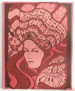
I got smart this time, though, mixing fluorescent paint with other colors instead of using highlighter ink on the finished product. The result is that this poster is twice as large as the other, yet took considerably less time to make. Not only that, but the color's more even under a black light, and albeit subdued, worked into other shades of red used.
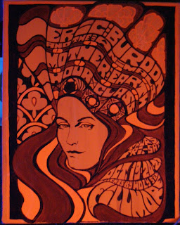
All in all, it turned out bolder than I expected - that magenta is a particularly unexpected shade - but I think it works and I'm far more pleased with this than with the other.
More should, hopefully, be coming soon. Possibly in blue.
Also, a question: How do these LABELS work? As a keyword search? On my blog, they're linked to whole separate categories so that I can separate my travel writing from my reviews. Can we just go nuts labeling our work?
Saturday, April 17, 2010
Tiger of Death

"Tiger of Death" is my submission for the April 24th PixelDrip Gallery at UGTL 6. I was originally working on a massive Capcom vs. SNK poster, but scheduling would not allow that to happen. It'll have to wait for the next show.
I wanted to create a simple piece using negative space. Again, I was under time constraints due to the submission deadline and the amount of work I already invested in the Capcom vs. SNK poster. A negative space illustration would allow me to ignore grayscale or color rendering. A straight inked piece on Bristol would also mean no time lost scanning and digitally modifying the image.

After seeing a clip of the Bruce Lee vs. Kareem Abdul-Jabbar in The Game of Death, I had my idea for the picture. I switched Fei Long for Bruce Lee and Sagat for Kareem. The dark pagoda where the fight took place had great contrasting shapes. The fighters' bright clothing and distinctive silhouettes popped out nicely against the window screens and stairs. The negative space dichotomy would also be complemented by the characters' size disparity.
I wanted both Sagat and Fei Long to perform techniques from their respective movesets. Sagat would be using his standing medium kick (a powerful "poke" attack). Fei Long would be trading hits with it using his Rekkaken attack (his signature combo attack).
The trouble with Sagat's kick is that despite how strong it is in video games, it doesn't LOOK like an impactful move. To compensate for that, I included other elements in the picture that would convey the strength of the kick. His leg would be kicking through the wooden banister and colliding with Fei Long's forearm. I didn't want to draw motion lines to follow the kick's arc because it would clash too much with the window background. I settled for impact lines radiating from Fei Long's forearm since it meshed well with the flying debris.

I started "spotting the blacks" and inking earlier in the process than I normally do. I didn't want to be too concerned with erasing and redrawing minor changes. On one hand, it allowed me to finish in a timely manner. However, it also allowed for some slight perspective errors to remain.
As I continued to ink the piece, I became more concerned with line weights, feathering, and crosshatching than negative space. I was focusing more on rendering the clothing wrinkles and muscles highlights than I was on where NOT to convey lines on the characters' outlines. It all goes back to my admiration for black and white comic art.

In the end, "Tiger of Death" isn't a typical negative space picture like the Scarface poster. The only visible use of it is around Fei Long's Onitsuka Tiger shoes. However, composing the illustration still used negative space principles and I think the piece benefits tremendously as a result. The characters are clearly visible, even when viewing the piece from a distance. If I had more time, I would've done some Art Adams-level texturing on the floor and possibly added some furniture in the background.
With this piece done, I can resume work on the Capcom vs. SNK poster. Of course, working on "Tiger of Death" also gave me other ideas for movies that I can mix with Street Fighter. I'll have to save those for another time.
Friday, April 16, 2010
Dawn of the First Day
Just to clarify, there was no trouncing. There was a wee-smidgening, and I think it was largely a matter of sheer and godforesworn luck.
That being said, I am damned happy to see this blog getting activity again, and I think the talks regarding the potential for a shared studio/gallery place are unavoidably intriguing. Once again, I am advocating a Downtown position because I am greedy for and ignorant about the LA area and I believe it to be the nearest to where I currently reside.
So dust off those links and get to pestering!!
Subscribe to:
Posts (Atom)